Contact us

Omniture Articles
3 Steps To Testing & Customizing Your Offer-Based Landing Pages
In our last two newsletters we focused on landing pages: first, we showed you how you can create a series of landing page templates that will help you to customize three types of landing pages -- homepage-like landing pages, offer-based landing pages, and category landing pages -- and to use them to target different types of customers.
Then, we showed you how to test various elements in the category landing page in order to find the best-performing page possible. Once you have found the combination of elements which converts visitors at as high a rate as possible, you can then begin to customize it for different groups of visitors.
Now it’s time to focus on the offer landing page.
An offer-based landing page is one you use for visitors with the highest of intentions. If I’m searching for a new BlackBerry 8700c, and I type that phrase in a search engine, for example, I probably have my credit card ready to go.
Your job, with a customer this highly intentioned, is to reflect that intention and to make the most compelling offer you can in order to get me to close the sale.
How? First, and most obvious, you want to match the product as closely to the search term as possible. If I’m searching for the BlackBerry 8700c, don’t then offer a generic BlackBerry page.
But what do you do then?
Consider these three areas and run tests to see which elements within the areas are most successful in closing the sale.
Consideration #1. Real estate for the offer
Decide how much real estate you want to devote to the offer itself. How big should the image be? How much of a brand frame do you want to allow to intrude on the offer?
You'll want to consider:
- Brand framework:
Do you need navigation to your home page? Third party endorsements? - Navigation:
Are you willing to allow visitors to navigate to other areas of the site in the event they changed their mind about the product, or want to purchase something else in addition to it? - Offer itself:
Does someone this high intentioned want to see a large image of the product with a small price? A large price, with a small image of the product? Product attributes? - Alternative products:
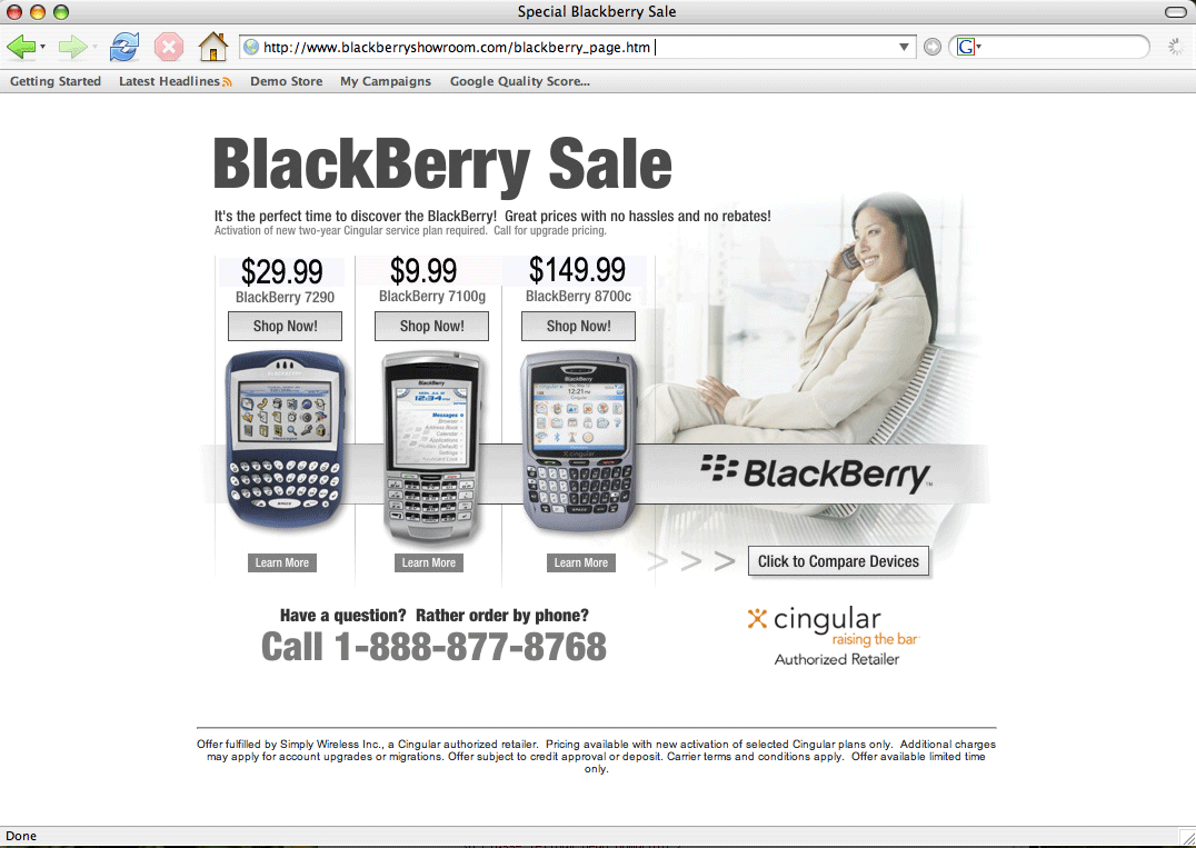
Are you willing to use real estate for other products similar to the one being searched? In other words, in the event you totally miss the ball on the visitor’s intention, how much space are you willing to use to try to gain their interest back? In the BlackBerry scenario, for example, Simply Wireless’s BlackBerry Showroom shows two other BlackBerry devices, the BlackBerry 7290 and the BlackBerry 7100g. (To see the full-size image, click on the image.)
Test all of these elements within the consideration of your offer real estate to see how much space you can afford to devote to each.
Consideration #2. Call to action
A consumer actively seeking a particular product or service may need nothing more than the right call to action to tip them over to the sale. Test your button size, format, layout and location.
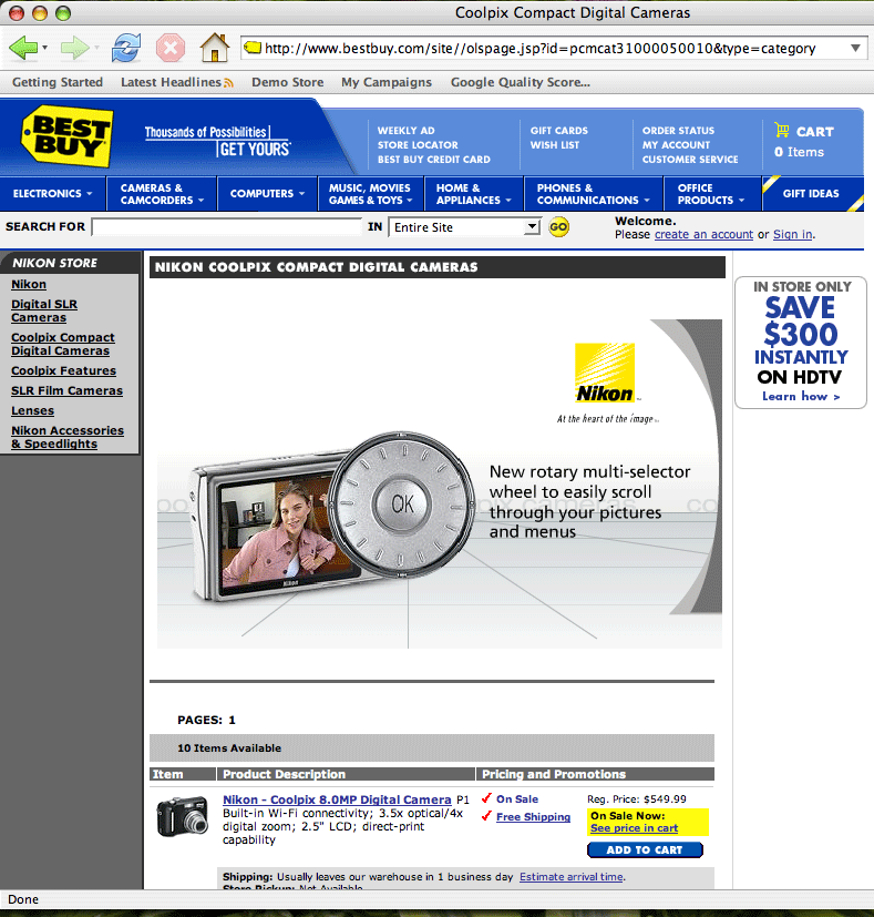
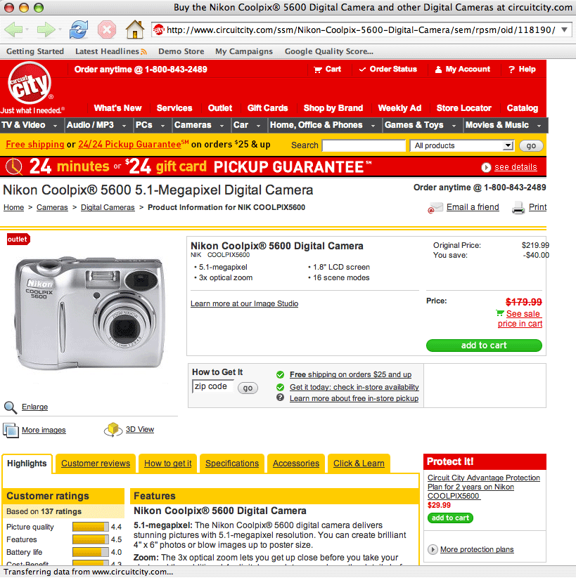
The Best Buy offer page for the keyword “Nikon Coolpix,” for example, has an “Add to cart” button that is small and below the fold and is, in fact, nearly impossible to find, while Circuit City’s “Add to cart” button is bigger, brighter, and in a more visible area of the page. (To see the full-size image, click on the image.)
Specifically, test the language. We have found that buttons with calls to action should complete the phrase, “I would like to...” In other words, text on buttons might read:
- (“I would like to”) Shop now!
- (“I would like to”) Get a loan.
- (“I would like to”) Compare products.
- (“I would like to”) Learn more.
Consideration #3. Other ways to convince them to buy
Beyond the offer (free shipping, price, etc.) and the product itself, there are other ways to convince people to shop on your site. Those are your unique attributes for the way you’re selling: free shipping with every order, automatic renewals, personalization, etc.
Back to the BlackBerry example: the BlackBerry Showroom offers the opportunity to compare devices. Click here to see Blackberry screencap again.
Test these attributes to see if your customers find them valuable.
Finally, consider attempting to monetize each visitor, even if you are not successful in convincing them to buy. You might offer them a branded credit card, suggest that they sign up for your newsletter, or offer to send them RSS feeds of new products in their area of interest.
Test a variety of treatments for each of these elements to determine the best combination for your offer landing page. Then, customize the landing page depending on keyword or keyword group.
Remember, your job here is to capture the click and keep the consumer moving toward the transaction. If a link or other use of the space is not advancing the sale of the product for which they’re searching, it’s potentially going to hurt the conversion.
In other words, the space that you’re using on the landing page is not, contrary to what many marketers believe, free real estate. Each element that takes away from a consumer’s goal of making a purchase costs you money.