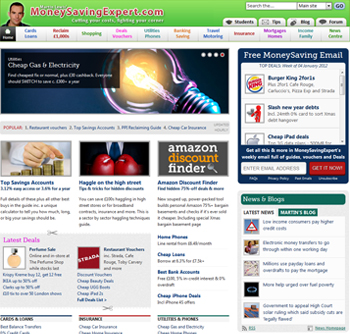
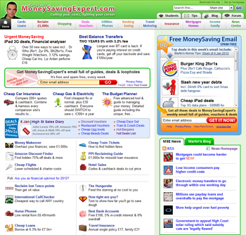
We have a brand spanking new home page. Hopefully it’s a lot easier to navigate and looks much cleaner – though that’s for users to judge (do leave some feedback below, which we’ll use with tracking stats). Yet this is just the start and I wanted to explain why we changed it and what’s ahead.
I still do occasionally get people asking: "Do you do the site from your bedroom?" Well that’s how it started back in 2003 (see the history of MSE), but those days are long gone, there are 35 full time people including myself working for MoneySavingExpert.com (if you’re wondering how, see how this site is financed).
We’re a top 100 UK website, with over 10 million unique users (different people in the UK using the site) each month, and while I hope the quality of the content and research is up to scratch – the design still has somewhat of a homemade feel.
This has always been deliberate. When reworking the site in the past, I’ve always been protective of the scattergun, cluttered feel – not wanting us to look corporate, to impart the fighting for consumer philosophy and generate an esprit de corps amongst users.
In fact, back in 2006, I pulled a redesign two days before launch – almost causing mutiny at MSE Towers – because all the feedback I got was: "It looks good, very corporate and professional" (see my redesign blog from back then for a view).
Yet I now think the web has changed – even many bedroom sites nowadays are much more professional, and we’ve changed. We are now a very established site, our users know what we stand for, so it can cope with a redesign making it look more professional without it hitting the all-important ‘fighting for consumers’ stance – especially if that makes it easier for people to find the info.
So while we’re still a personal site (not just me anymore though), I hope we retain that element of a professional media site, not a business one.
How the home page has changed
You can see the various looks over the years here…
> Pre-launch site 2002 (more a personal homepage really)
> The first MSE site 2003
> MSE 2005 – minor changes
> MSE 2007 – getting more green
> MSE 2008 – after the last major redesign
 |
 |
| View New Home Page | View Old Home Page |
The new home page isn’t the final version, but as January’s a busy month and we had something we believe is a lot better than the old one, we decided to get it out and then prune it live. Congrats to MSE Lawrence, Neil and Richard, plus Adam and Mark amongst others for doing some brilliant work on it.
Yet this is just the start. We know lots of you love MoneySavingExpert, but we get constant complaints that "it’s too busy" and "I can’t find what I want" and that’s the real aim here.
The running order of the redesign
So as for what we’re planning to do …
- New masthead

This is still a work in progress (pic of me is far too big and not one I like either), yet the colour scheme and general look is roughly along the lines I want. As you can probably tell, the new home page was designed to have this masthead atop it – and once it’s there, I think the whole thing will all fit together.
- Much improved main site search – done
Try a search (top right of each page), we changed it a few weeks ago. Hopefully the results now bring what you hope for. It’s using back-end Google technology so should be more intuitive for most people. Do let me know what you think. - Changing the section categorisation
Some of the sections are spot-on, for example ‘cards and loans’ does what it says on the tin. Yet a few, like ‘Income and Family’ aren’t popular as they’re not too intuitive and it means people miss out on some valuable info. So we’re going to look at our categorisations and titles to try and improve this. - Sprucing up the drop-down menu
Hover over the section tabs at the top of every page, and you get a pop-up drop down menu. A huge proportion of users navigate the site this way. The current design was our first try, before we understood how people use them. Now we think we can get more in, but looking less cluttered and easier to understand. - Bespoke section pages for each subject
Currently each of the actual section pages comes from our template, with minimal work to it. We hope to redo them going forward, more in the vein of the new home page, but each being specifically designed depending on the content. - Right hand side browse bar spruce
The top bar of the site is for navigation – the right hand side for browsing and trying to get people to navigate across the site (don’t look on this page, go to the forum or a normal article). Some of the boxes in there work. - Multi-platform accessibility (incl. mobiles)
The site isn’t currently awful on mobiles, but it could be better and as we go forward we’ll be building to try and make it work for mobiles and tablets. Many have asked for an app, and it’s something we’re looking at, though for a site the size of MSE it’s still conceptually difficult to work out how that’d work.
Those are the main ones, we’ll also be taking a look at the forum, though that was done more recently so isn’t as high up on the agenda.
Do let me know what you think of the home page and any suggestions you have below.


Comment via Facebook login
This is an open discussion; anyone can post. Please report any spam, illegal, offensive, racist, libellous posts (inc username) to fbteam@moneysavingexpert.com