Contact us

Omniture Articles
67% Increase In Conversions For BabyCenter.com Through Search Keyword Tests
Layout BEFORE Offermatica: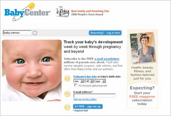
Opportunity
When BabyCenter took a close look its landing pages, they noticed something unacceptable: the landing page for the company's most popular search term converted about 30 percent less often than the company's general landing page.
By tapping Offermatica to devise a test that ran four new versions of the page simultaneously, they were able to increase conversions by 67 percent and decrease abandonment rates, to boot.
Testing Approach
Because "baby names" accounts for such a large slice of BabyCenter's traffic - about 11 of their top 20 paid search terms are related to that phrase - and because the annual baby name list would be released in December, Senior Marketing Manager Heather Wajer and her team spent the early fall looking at landing page conversions.
Of their two landing pages, they learned that the baby names landing page converted at a rate about 30 percent lower than the general paid search page. Abandonment hovered at more than 40 percent.
"There was a big disconnect between the ad copy, the search term and the page. It wasn't a relevant experience," Wajer says.
Campaign
BabyCenter's deep content surrounding the baby names topic includes tools such as a name finder, lists of top baby names, baby name polls, and more. But the baby name landing page showed nothing of that content.
Rather, both pages were nearly identical: They each included a picture of a baby, a short registration form, a log-in box for returning members (top right), and a search box (top left).
The only difference? The search box on the landing page for those searching for baby names was pre-populated with the phrase "baby names." The search box for the generic landing page was empty.
People who arrived at the landing page using that search term were not finding the content they hoped for, and were jumping ship.
BabyCenter tapped web testing and optimization company Offermatica to pull together a test of four different landing pages.
They all had some similarities:
- A picture of a baby
- Headline: "Looking for baby names?"
- Three-step registration process, labeled, "Getting started is easy!"
There were some major differences:
- One included teaser copy, with the top 5 names of 2005 for boys and girls.
- One included a bulleted list that talked about the different features, such as the poll and the baby names finder.
- The third, flying in the face of registration conversion conventional wisdom, included six links to other areas within BabyCenter.
- The fourth simply contained the headline and call to action, with no extra copy.
The team also ran the original landing page as a control.
Results
"I was surprised that we saw as much of a lift as we did. I was also surprised which one won," says Wajer, pointing out that the most basic landing page increased conversions most significantly.- The simplest landing page increased conversions by 67 percent. (Conversions were measured by registrations and lag registrations, up to two weeks after the first visit.) It also reduced page abandonment by 37 percent.
- The version with the bullet points increased conversions by 62 percent, and decreased abandonment by 40 percent.
- The version with the links increased conversions by 10 percent.
Interestingly, the version with the teaser (top 5 baby names for boys and girls) reduced conversions by 2 percent.
With the new landing page, the team reduced cost of acquisition by 41 percent.
Winning layout, WITH Offermatica:
Lesson Learned
Wajer learned that testing must be ongoing. "We have adopted a continual test-and-learn philosophy," she says. Currently, they run anywhere from two to six tests at a time.
More Details
BabyCenter Delivers Optimised Landing Page for its Web Ads